Colors
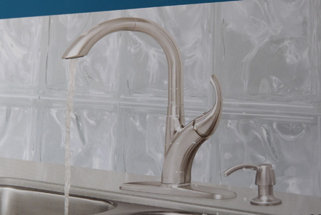
Monday, August 4th, 2008So we’re trying to pick a color for Kate’s room. It’s not as easy as I expected (and hoped) it would be. We’ve tried every green and moved on. We’re now onto pinks. Anyone who knows me knows that a pink girl’s room isn’t something I automatically gravitate towards (run screaming from would be more like it). And no matter how pink her room is I’m not getting a chandelier (sorry Mom!). But we’re stuck between two colors. The first one is really pink. Almost bubble gum. It’s a nice color but it’s a small room and we worry it may be overwhelming once it’s on all of the walls. The second one is a very pale pink. I worry that it’s not pink enough. I want it to be contrasting with the white trim but just enough. These two colors are right on top of each other in the color swatch palate from Sherwin-Williams so without making a custom color there is no in between. The color I was looking to emulate was the one by Restoration Hardware, which is horribly over priced. What are your thoughts? I promise this won’t be like the kitchen faucet poll. Promise.
Here is the pink at Restoration Hardware -


And here are the two colors we have. I realize they look slightly different in every photo and to every person because of lighting and color calibration on your monitor. One thing I can tell you to help judge is that the brown that’s currently in the room is a really dark tan with a bit of a green tint.

And the fabric between the these two painted areas is what the bedding is being made with. The green fabric will be the bumper and the crib skirt is white with the pink ribbon trim.


Here is the lighter of the two pinks against our trim since that’s my biggest concern with the light color. Does it look pink enough or just a different shade of white? The darker pink definitely contrasts with the trim, I just worry Kate will think she lives in Barbie’s room. The two colors below are the same color.